
Shaklee
Intro
Shaklee is a direct-to-consumer wellness brand built on personal relationships between independent representatives and their customers. This project was commissioned by a local Shaklee rep who needed a way to make every customer order feel personal — not promotional.
The Challenge
Make every order feel personal, not promotional.
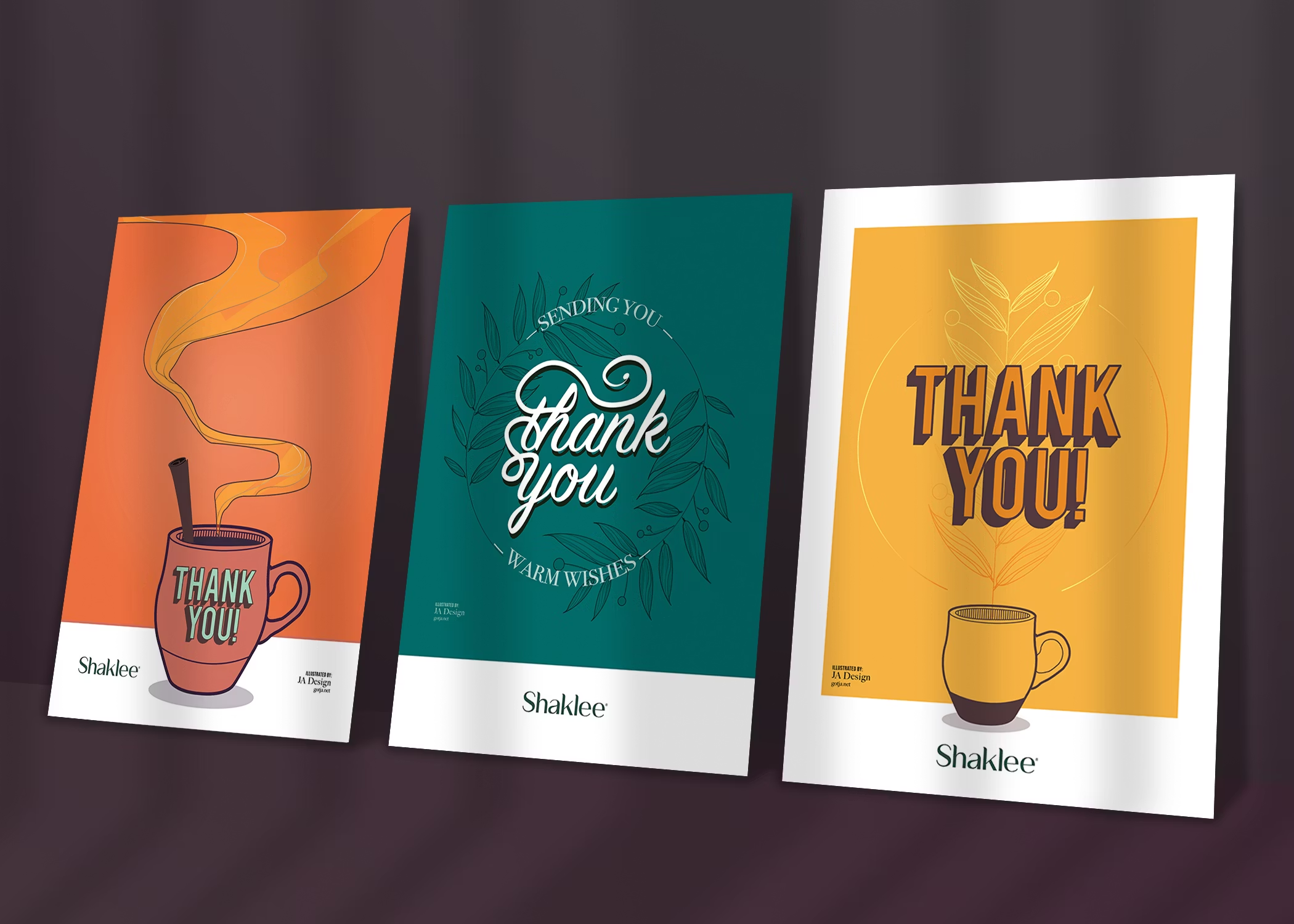
The ask was specific: two seasonal series, Spring/Summer and Fall/Winter, totaling seven 5×7 card options. Each one warm enough to feel personal, polished enough to reflect well on the Shaklee brand, and varied enough to give the client something to choose from depending on the moment.
The harder part of the brief was the one that wasn't said out loud: these cards had to feel like her, not like a brand kit. If they read as corporate filler, a customer would put them in a drawer. If they read as personal, a customer might keep them.
Work
The Approach
You're being welcomed into something, not sold something.
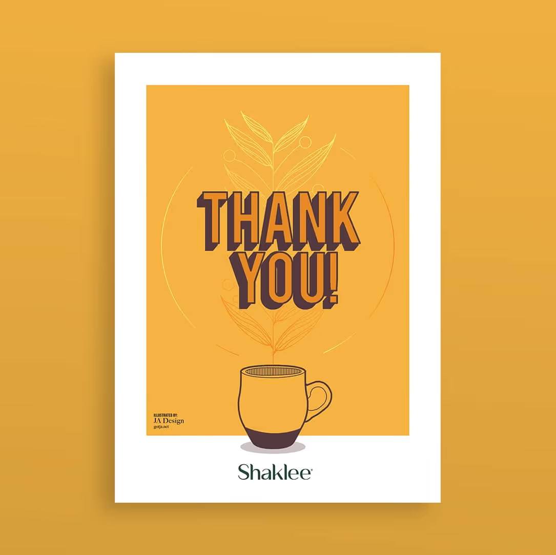
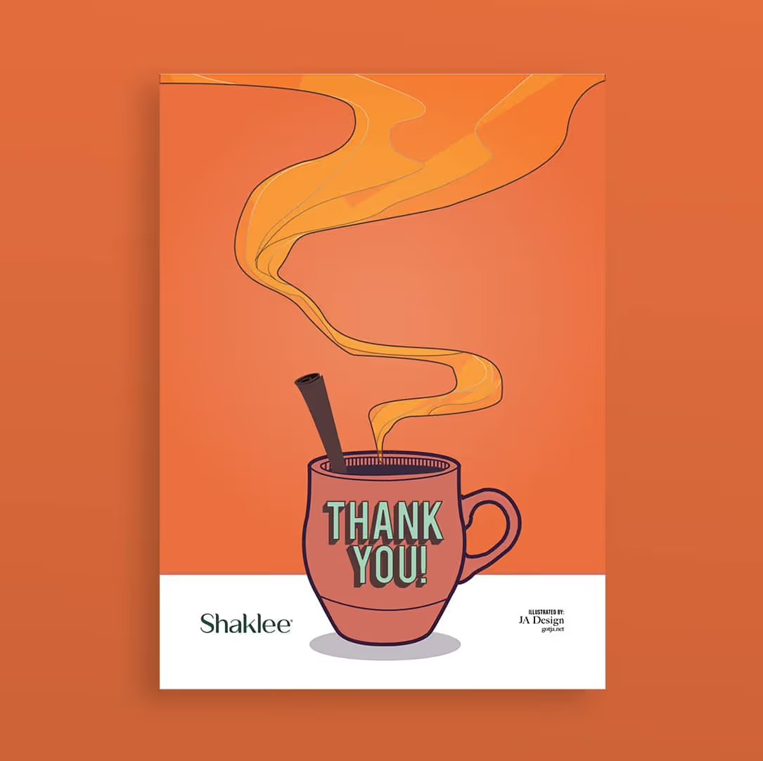
Every card was built around a single idea. The illustration style was kept warm and conversational — the visual equivalent of how a good thank-you note sounds when someone actually means it. Two distinct seasonal palettes gave the series coherence without making them feel like they came off an assembly line.
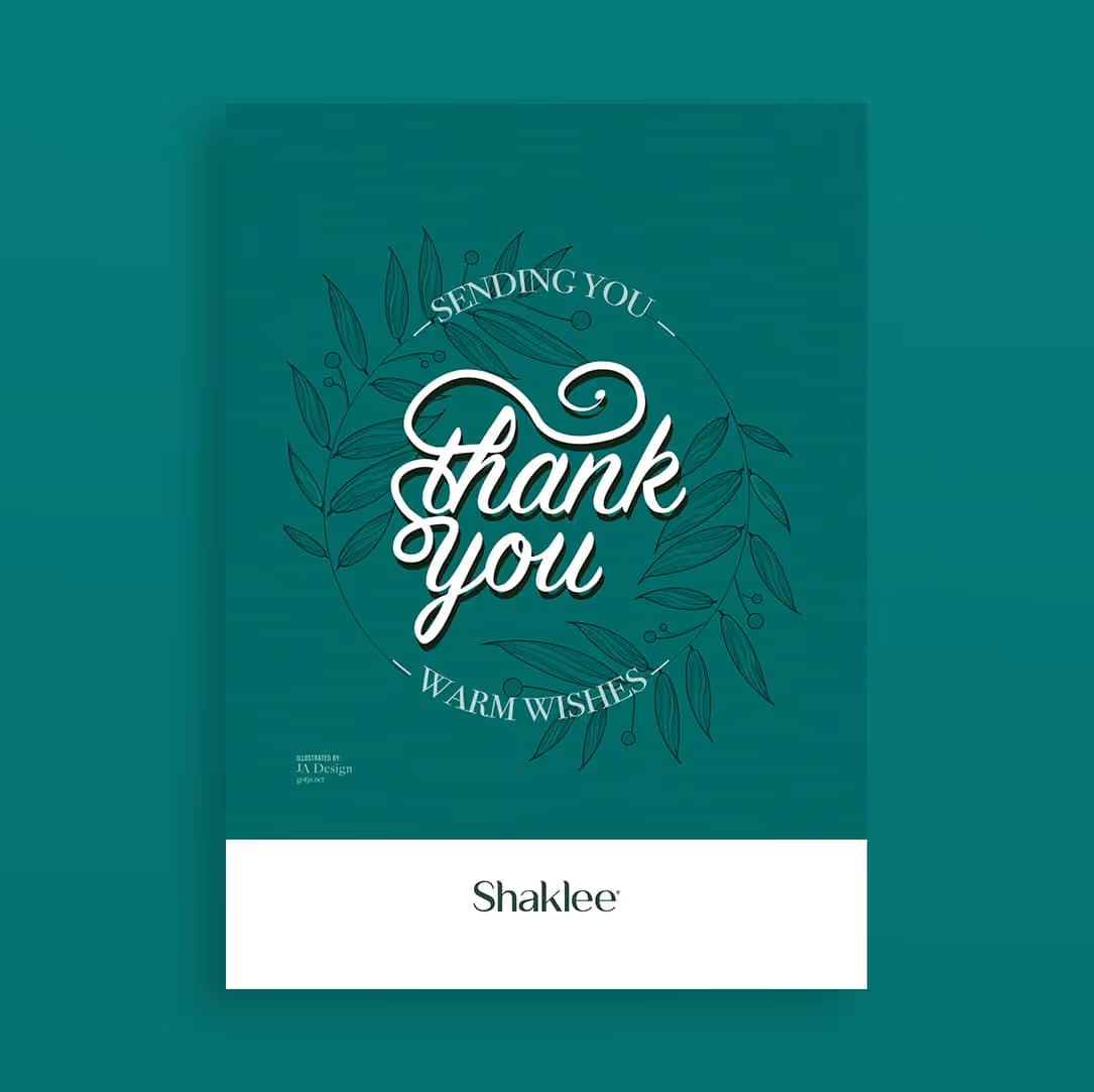
- Fall/Winter series — three cards in rich, muted tones (burnt orange, deep teal, golden amber) with illustrated warm-drink motifs
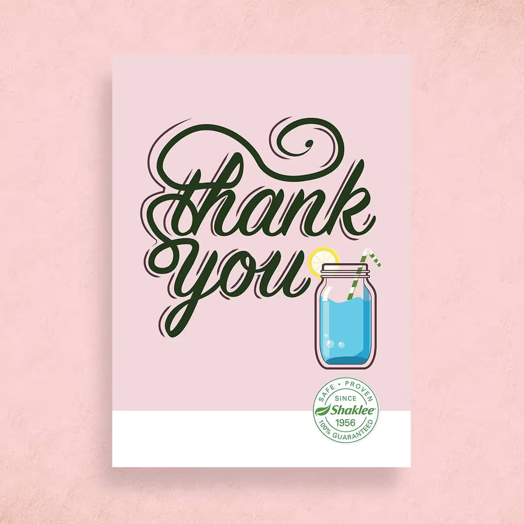
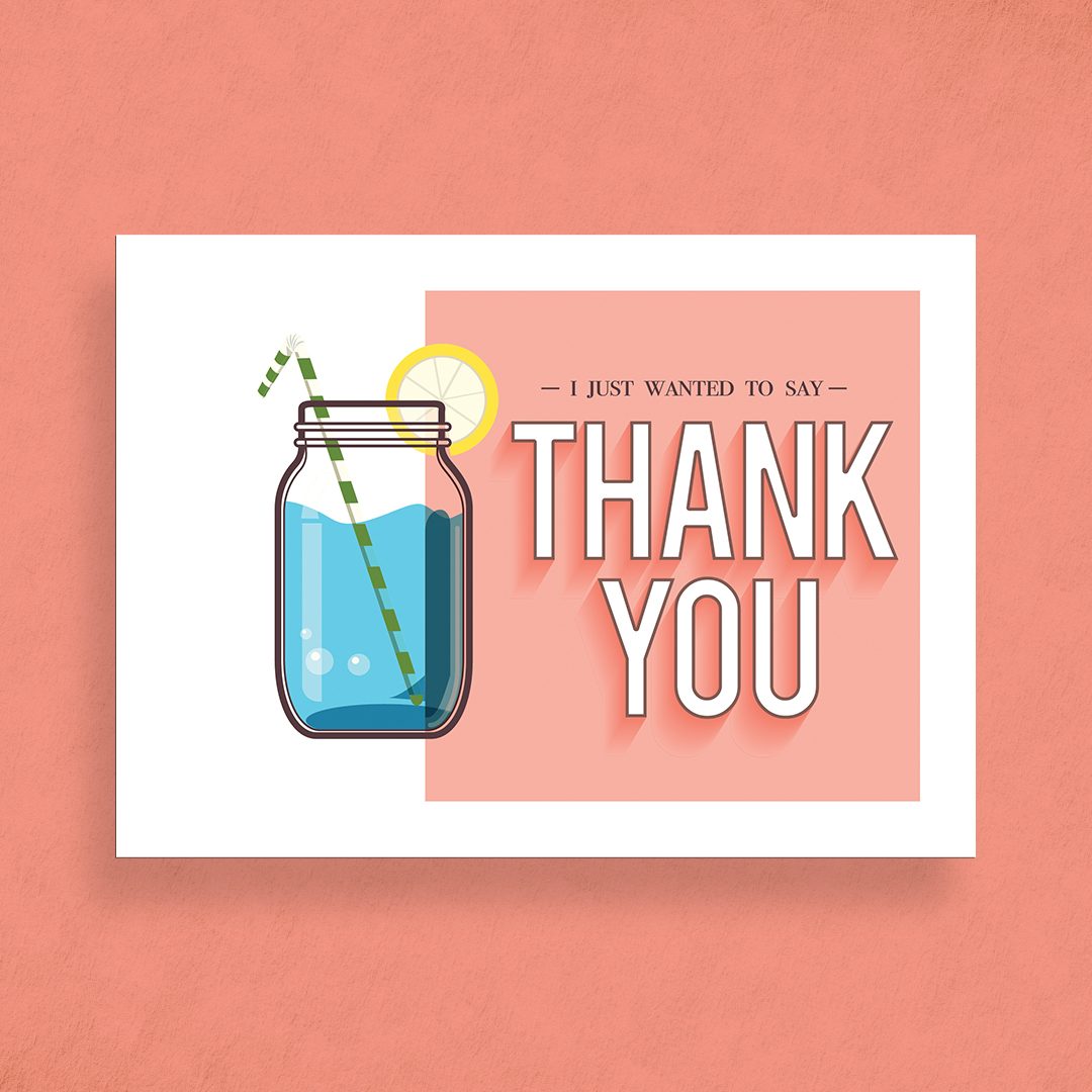
- Spring/Summer series — four cards in a lighter palette (soft yellow, blush pink, cool coral) with illustrated refreshment motifs
- Dual-purpose card backs — a message area, QR contact code, and Shaklee brand stamp, designed for personalization
- Two illustration styles — bold display lettering with character illustration, and script hand-lettering with botanical line art
Both series were designed to work front and back — the illustrated front for the moment of opening, the back for the rep's personal message. The full series delivered in two weeks.


The Implication
When a client keeps everything, that's the work landing.
This project demonstrates JA Design's ability to translate a personal brand and an emotional objective — “make my customers feel valued” — into original illustration work that functions as a business asset. No stock. No templates. Seven cards, built to be used.
She asked for options. She kept all seven.
Have a personal brand that needs to feel like you?
Let's talk →