The instinct coming into an engagement like this is to start with what's visible — fix the labels, update the site, clean up the event presence. We held that.
Before touching a single deliverable, Diamond Creek needed a brand foundation to build from. What did this product stand for? Who was buying it and why? What did "premium alkaline water" actually mean to the customers stocking their fridges with it? Everything downstream — every label, every web page, every shipping box — needed to follow from answers to those questions, not precede them.
A full rebrand was considered early. We recommended against it. The core identity had equity worth preserving — the diamond mark, the alkaline positioning, the premium-but-accessible feel. What was missing was the system. We focused on building that.
What Diamond Creek now has:
- Brand architecture — Documented voice, customer personas, and competitive positioning to anchor every design decision going forward, made by anyone on the team
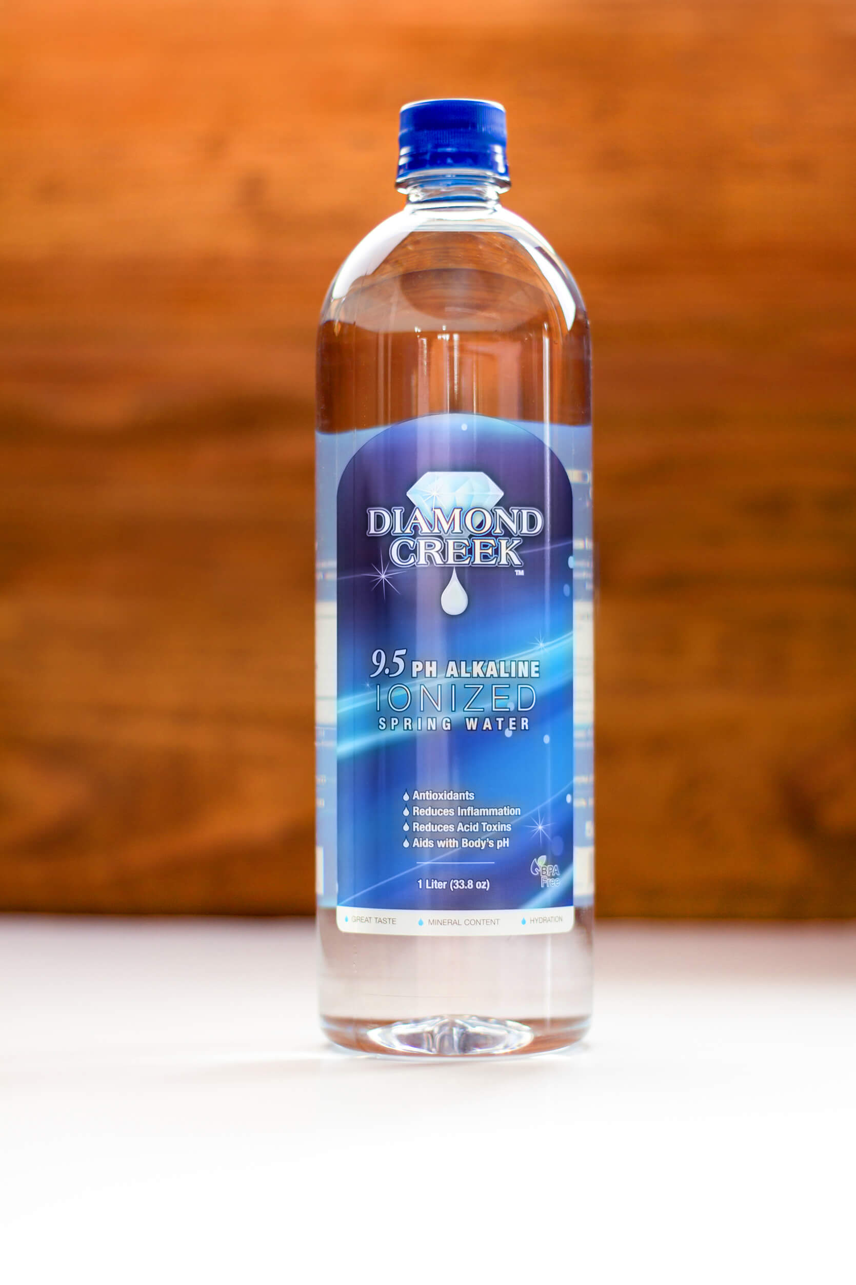
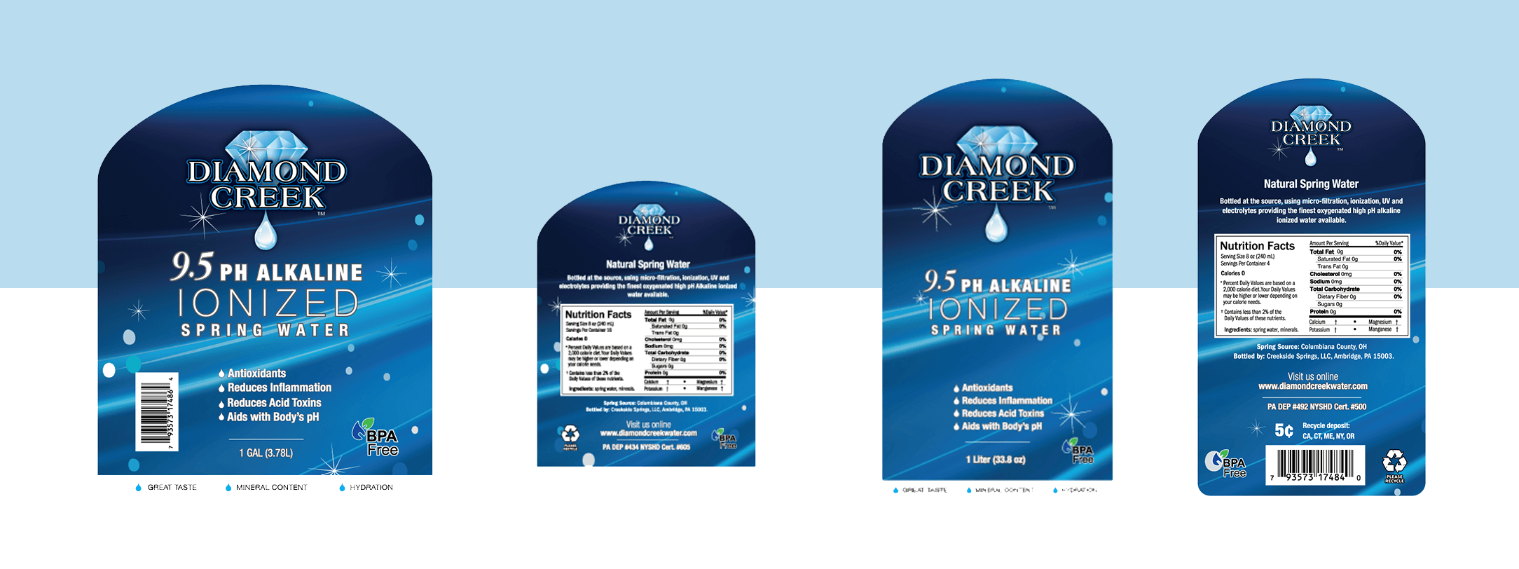
- Label system — Redesigned 1-gallon and 1-liter packaging using opaque label shapes that create visual consistency across two completely different bottle formats — a clear, unified shelf presence regardless of SKU
-
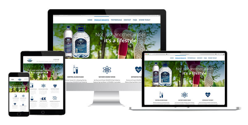
- Website redesign — Updated layout, social integration, and brand story hierarchy built for conversion — and a spreadsheet-driven Google Maps integration so adding a new store location takes seconds, not an hour
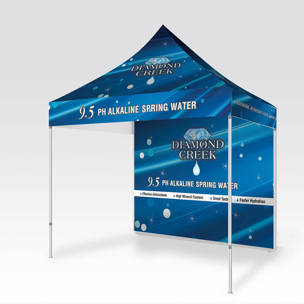
- Event marketing kit — A 10×10 pop-up canopy, back wall, and branded tablecloth that created a coherent retail event presence aligned with the new brand system
- Shipping box redesign — Bulk packaging rebuilt to carry the brand identity through the full distribution chain, not just to the shelf edge
- Brand illustration — Custom visual assets to extend the brand's premium positioning across touchpoints