
The Seventh Collective
Industry
Services
Results
Intro
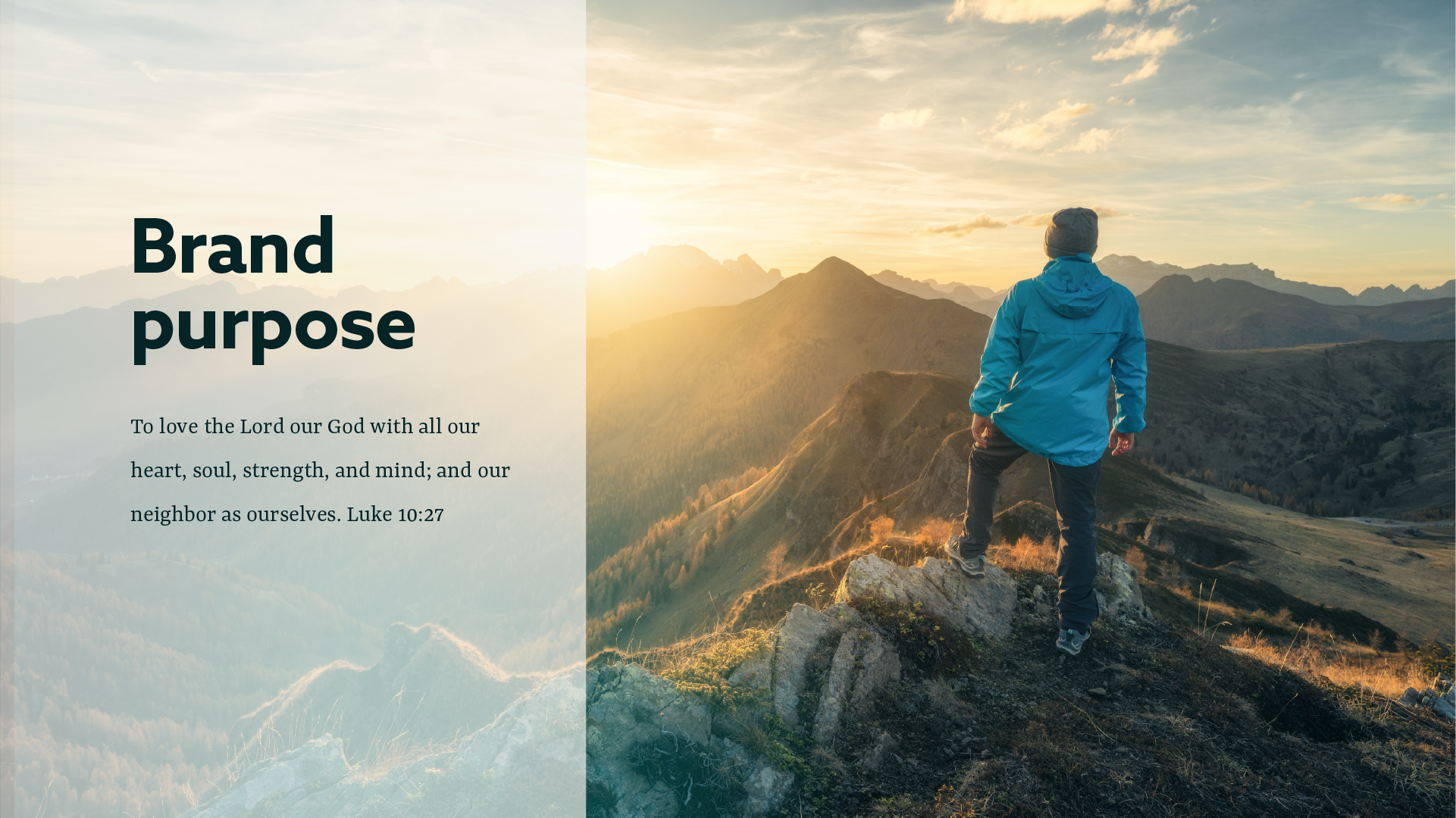
The Seventh Collective is a Seventh-day Adventist congregation building something unusual: a three-story, mixed-use ministry space inside a former prohibition-era office building in downtown Greenville, South Carolina. The building exists to serve the community Monday through Saturday and gather the church on Sunday. That idea needed a brand.
The Challenge
The mark couldn't look like a church — but had to mean like one.
The two pastors leading the project had a precise constraint: no crosses, no doves, no religious iconography of any kind. The building would serve people who had never stepped foot in a congregation, and a mark that read as overtly religious before anyone walked through the door would put the wrong signal on the wrong audience.
At the same time, the mark had to carry real theological weight — something specific about how this community understood itself. It had to speak to both audiences at once: to the skeptic on the street, community and welcome; to the congregation, the Trinity and shared faith.
The branding
The Approach
Start before the design does.
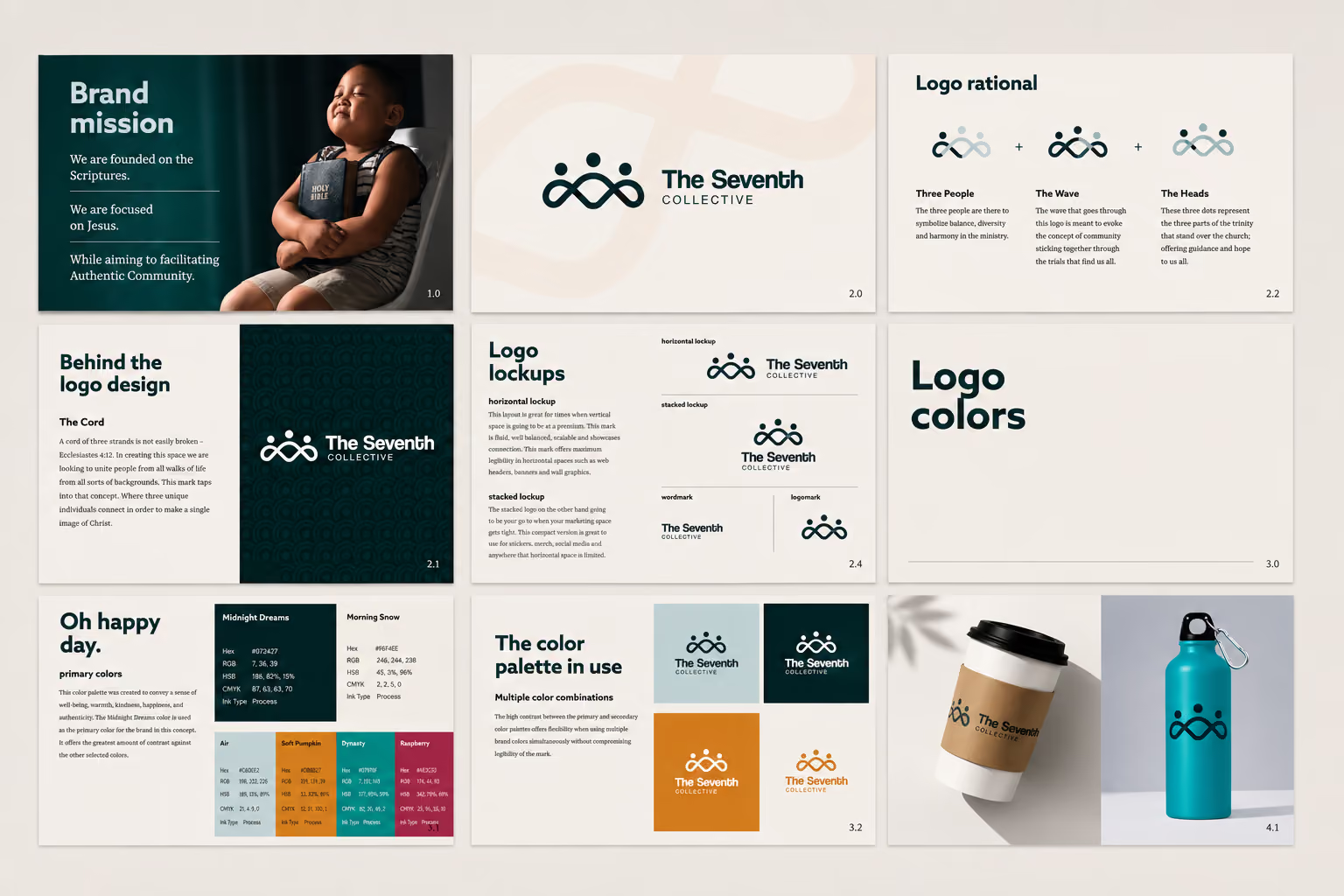
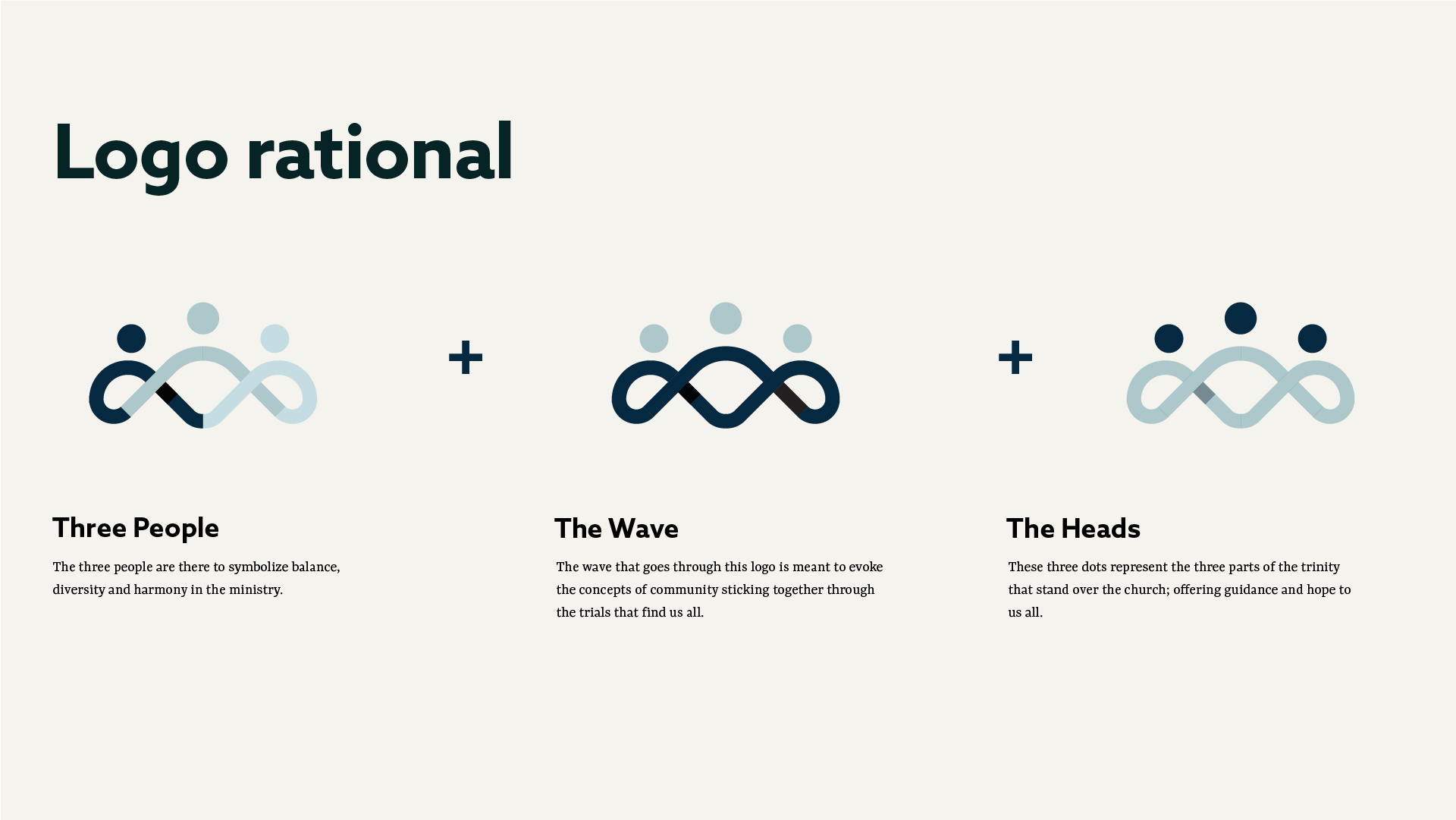
The brief ruled out the obvious answers, so the work started with a question, not a sketch: what imagery carries community and eternal connection in a way that predates Christian iconography, travels across secular and sacred contexts, and holds at every size? The answer came through two concepts working together — the infinity loop and a cord of three strands, embodied in three stylized figures.
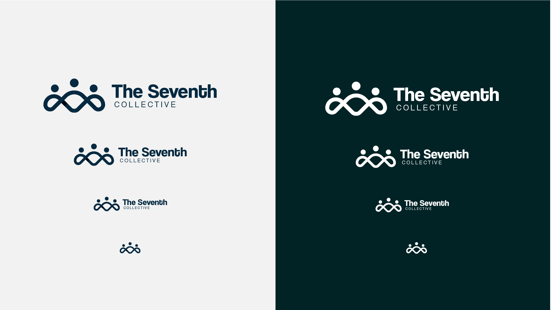
- Logo system — a full suite of lockups across four configurations, each in black, white, and full color: 12 SVG files ready for print and digital
- Brand guidelines — a 19-page document covering mission, logo concept, design rationale, scaling behavior, and application mockups
- Color system — a primary palette anchored by Midnight Dreams and Morning Snow, with four secondary accent colors for the full range of the building's programming
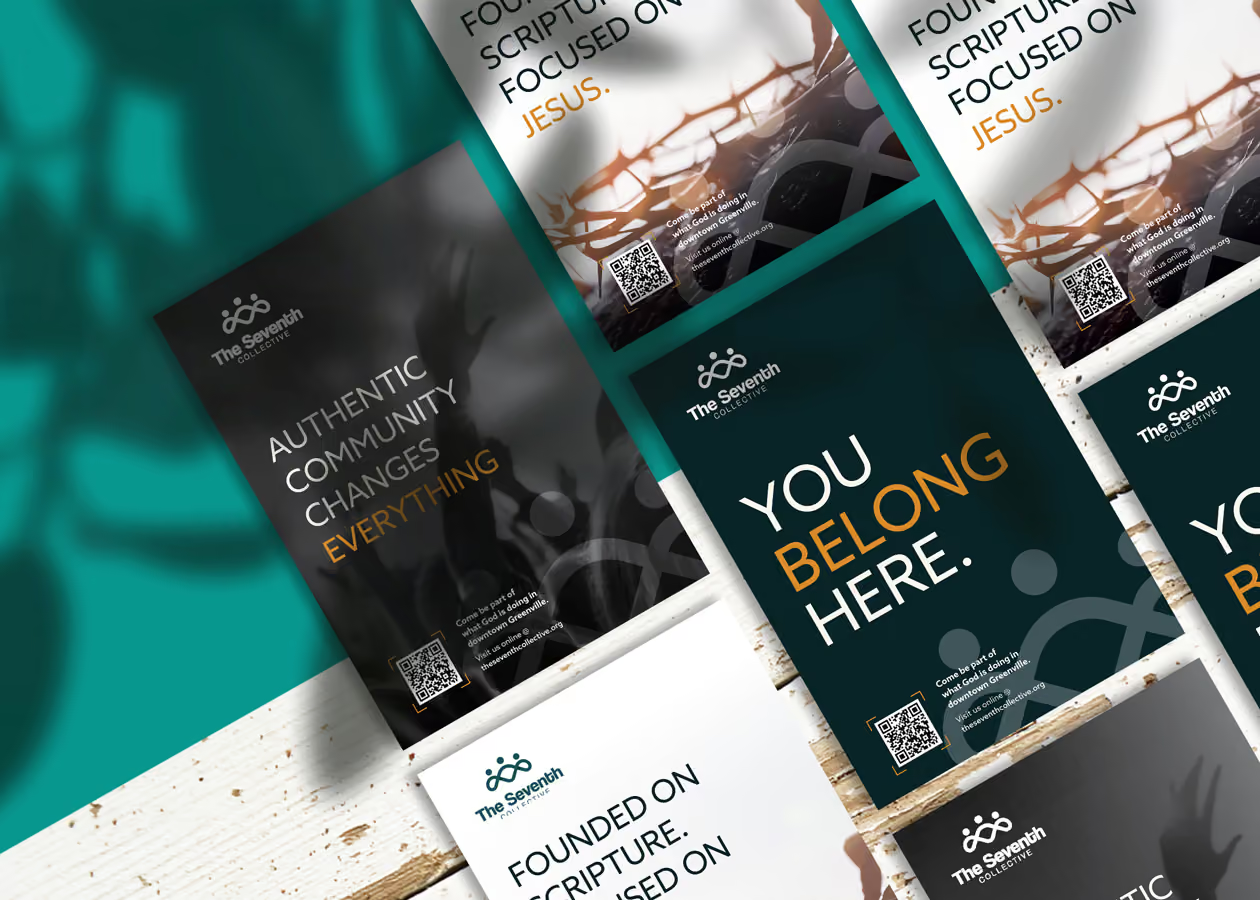
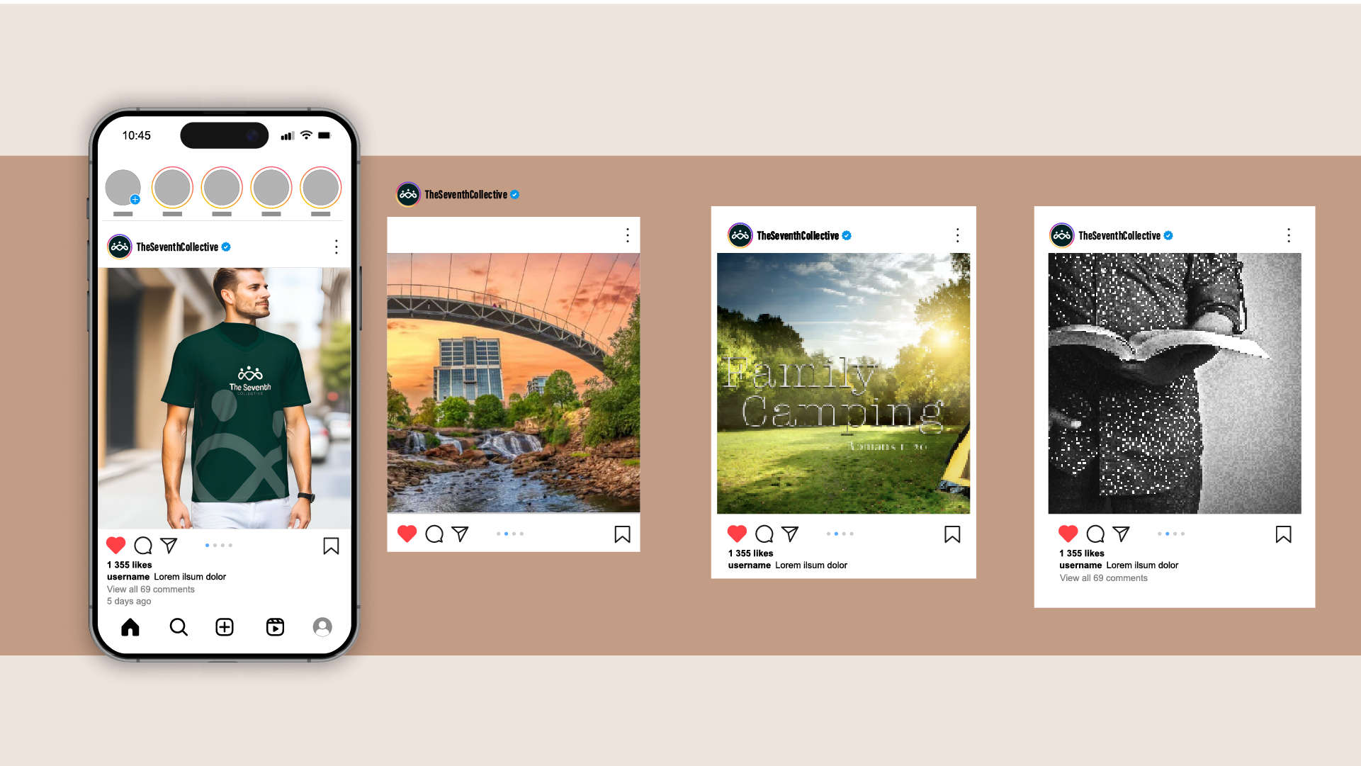
- Ad system — a full-page ad in three colorways for the ASI conference, built around an aerial photograph of downtown Greenville
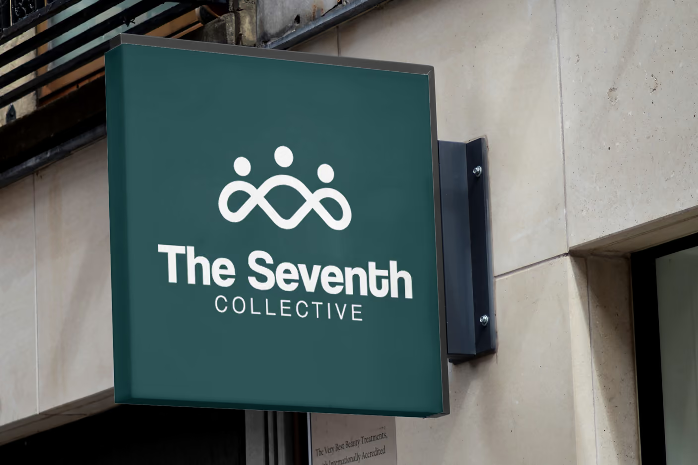
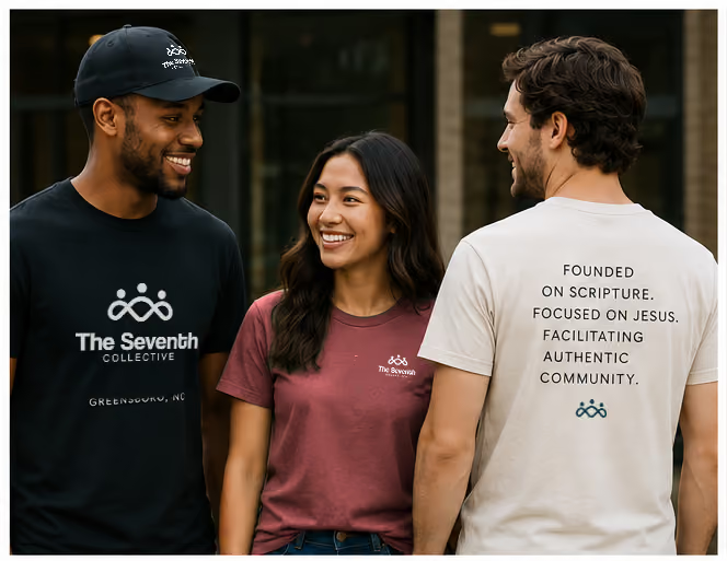
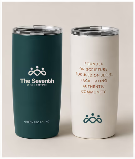
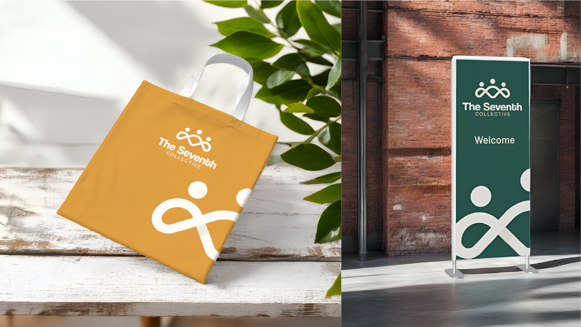
- Application mockups — signage, banners, apparel, drinkware, and tote bags demonstrating the system across the building's street-level presence
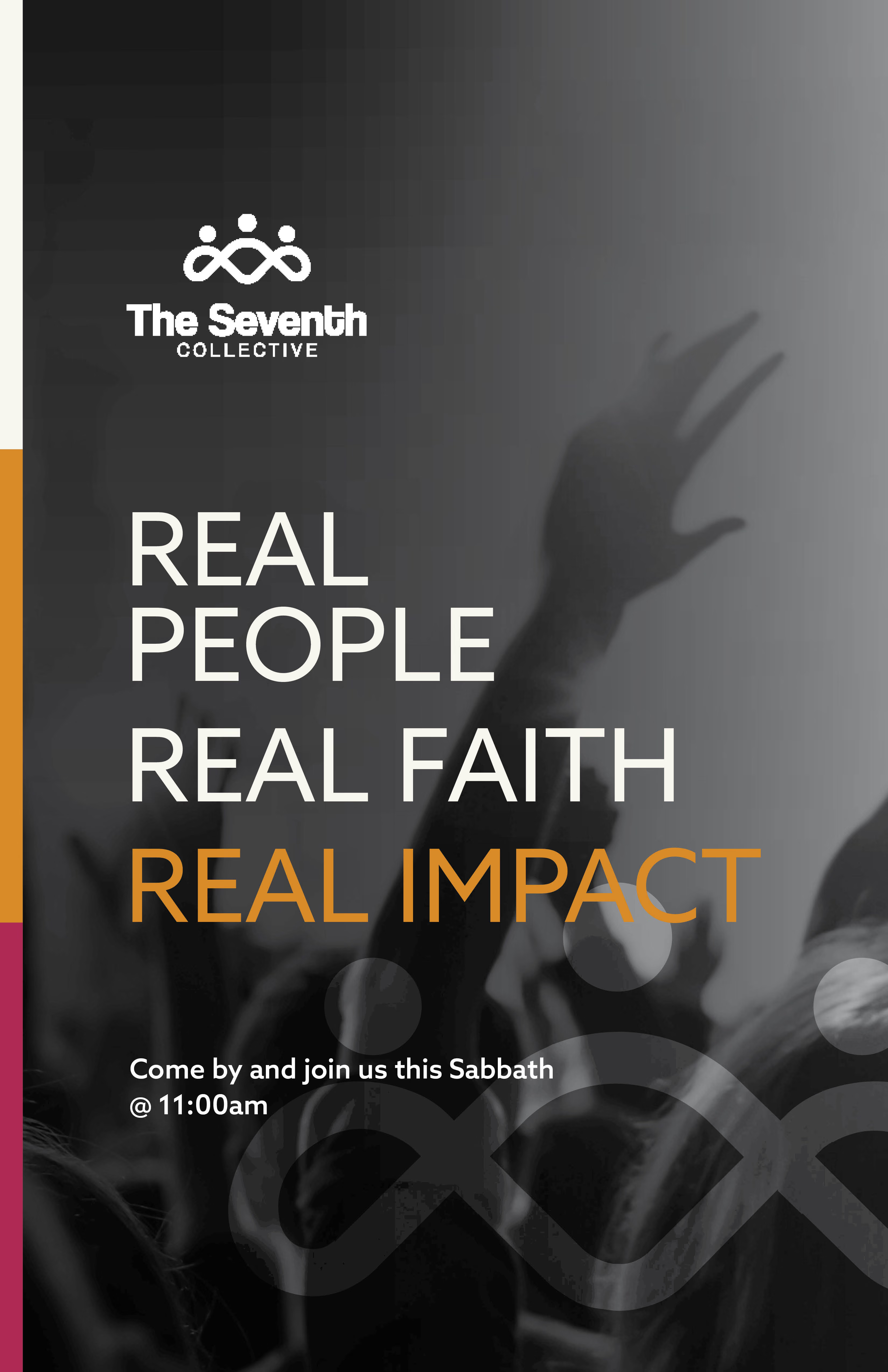
The mark reads cleanly as a simple, modern symbol of people in connection. The theology is embedded, not advertised. Someone who knows, knows. Someone who doesn't still feels the stability of the form.
The Implication
A brand built to open doors, not close them.
Before this project, The Seventh Collective had no brand — no mark, no guidelines, no system. After five weeks, it had a complete identity built to function in spaces where a church mark would close more doors than it opens, while still carrying the theological depth the congregation required. The client returned for a second engagement.
That's the work JA Design was built to do.
Building a brand that has to work for two audiences at once?
Let's talk →